
Armorpoint
Streamlined navigation and a data-driven approach improved usability, reduced drop-offs, and enhanced user engagement on ArmorPoint's website.
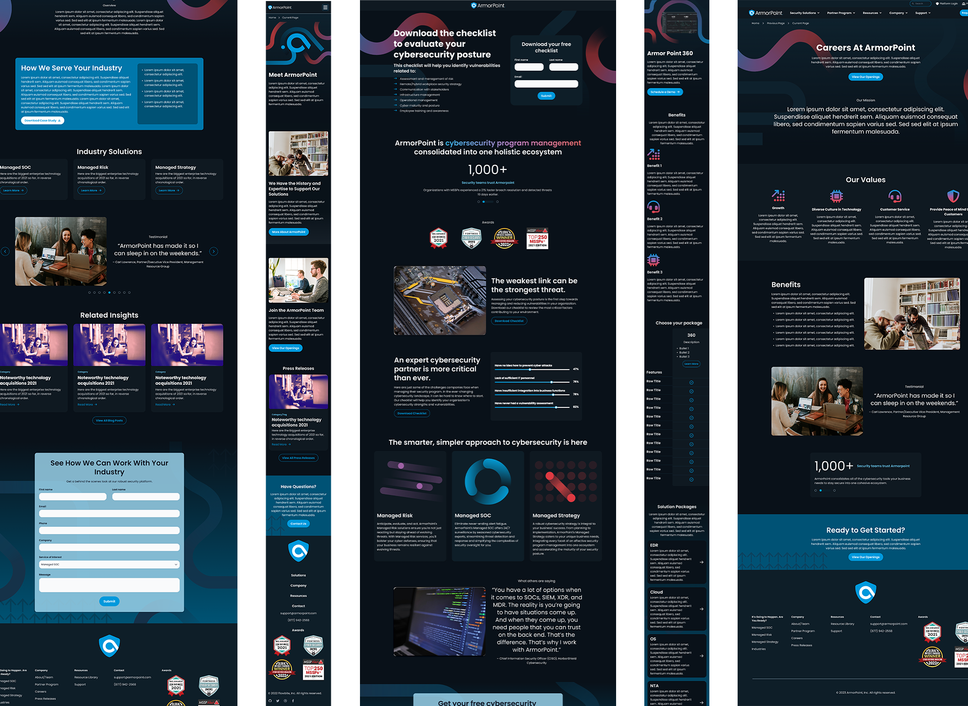
ArmorPoint, a cybersecurity company, approached VividFront seeking a comprehensive website redesign. Their goal was to unify their brand across digital platforms, creating a cohesive and professional online presence. As the Lead Designer, I was responsible for shaping the creative direction, aligning the new website with ArmorPoint’s brand identity, and ensuring that it offered an engaging and intuitive user experience. This project was part of a broader effort to modernize the company’s digital presence, positioning them as a leader in their industry.
Client
VividFront-Armorpoint
Role
Lead UX/UI Designer
Year
2022
The Problem
ArmorPoint’s previous website was plagued by several issues. It was poorly optimized, visually outdated, and difficult for users to navigate. Additionally, the website lacked brand consistency, with elements scattered across different platforms and collateral, making it hard for users to understand and trust the brand. ArmorPoint needed a site that not only solved these navigational and aesthetic issues but also unified their visual identity across all digital touchpoints.
Objectives
The primary objective of this project was to improve the user experience by creating a more intuitive and streamlined navigation structure. Beyond that, a significant focus was placed on enhancing the content strategy to promote ArmorPoint’s thought leadership in the cybersecurity space. This involved highlighting their blog as a central resource for users, designed to showcase their expertise and build authority within the industry. By improving both the content and the design, the goal was to establish ArmorPoint as a trusted leader while strengthening their digital footprint.
The Process
At the start of the ArmorPoint website redesign, one of the primary challenges we faced was the site’s disorganized and ineffective navigation. Users were struggling to find relevant information and often got lost, unable to navigate back to previous sections, leading to high drop-off rates. Addressing these usability issues became a top priority.
To resolve this, I began by conducting a comprehensive analysis of their existing content and user flows. My team and I performed a card sorting exercise to better understand how users naturally categorized the information. We also audited the entire site’s content, reorganizing it into easily identifiable categories that would streamline navigation. This process informed the creation of a new site map, which focused on simplifying the overall structure and ensuring that users could easily move both forward and backward through the site without frustration.
With the site map in place, I developed wireframes for key sections, testing different layout options to enhance user engagement and improve clarity. These foundational steps paved the way for a more intuitive and user-friendly design, ensuring that the updated site would meet the needs of both users and stakeholders.


The Design
Following VividFront’s standard website design process, I led the effort in competitor research, user profile development, and user testing to better understand the market landscape and target audience. We began by analyzing the current state of ArmorPoint’s website, gathering insights that would inform the next steps: site mapping, wireframing, and prototyping. My primary focus was on the UI/UX aspects of the redesign, ensuring that the new site offered a streamlined and cohesive user experience.
In collaboration with VividFront’s marketers and developers, I worked to integrate ArmorPoint’s brand elements across the entire site, innovating with their color palette and brand assets to create a more dynamic, cohesive visual identity. We pushed creative boundaries to deliver a website that was both visually engaging and strategically aligned with the company’s goals.


The Results
The redesigned website successfully unified ArmorPoint’s brand identity, creating a consistent and engaging digital presence. While this project was a stepping stone for further brand development, the redesigned website laid a strong foundation for future growth. The client was highly satisfied, noting the improvement in usability and brand cohesion.


